WPF Image Processing Developer's Toolkits
Add image-processing and scanning functions to your WPF applications!
Easy to use image annotation functions! Support for web camera too!
Distribute enduser runtime applications free without additional fees or royalties!!
|
For .NET Framework 4.X ImageKit®WPF US$799.00 1 PC Developer License (includes a one-year subscription) US$399.00 Server Runtime License US$399.00 1 PC Subscription Renewal (annual subscription renewal)   |
|
For .NET 5.0 ~ .NET 9.0 ImageKit®WPF X US$799.00 1 PC Developer License (includes a one-year subscription) US$399.00 Server Runtime License US$399.00 1 PC Subscription Renewal (annual subscription renewal) |
| Click here: Compare ImageKit® components for .NET, WPF, and ActiveX |
 .NET imaging component
ActiveX imaging component
VCL imaging component .NET imaging component
ActiveX imaging component
VCL imaging component
|
|
ImageKit WPF and ImageKit WPF X are Windows Presentation Foundation (WPF) components from the best-selling series of image processing components developed and sold by Newtone Corporation. WPF application programmers can use the ImageKit WPF and ImageKit WPF X to easily add advanced image and image processing capabilities to their applications. A variety of image annotatation toolbars are included so that you can add image editing and annotating capabilities to your applications. Annotations are saved in separate files so your annotations can be saved and reused on different images. Numerous controls for WPF are included and many versions of Visual Studio are supported. ImageKit WPF X supports .NET 5.0 and above. The ImageKit WPF and ImageKit WPF X enable your applications with scanning capabilities to retrieve and manipulate images from TWAIN scan devices, including document scanners and digital cameras. Save images directly to file or stream. Load and save images to and from various formats, display images in a variety of ways, perform a wide variety of image processing functions. |
|
| ImageKit WPF and ImageKit WPF X scanning functionality has been developed with the cooperation of these manufacturers. |

|
ImageKit WPF / ImageKit WPF X Controls
The ImageKit WPF (.NET Framework) contains both WPF and Web Form controls. The ImageKit WPF X does not support Web Form controls.
WPF Controls:
 |
ImageKit Control | This control performs scanning, image display, processes effects, loads files, saves files, and annotates images. |
 |
ToolBarStandard Control | This toolbar control performs the basic functions related to annotations and image files. |
 |
ToolBarAnnotation | This toolbar control performs image annotation. |
 |
ToolBarSetupLines | This toolbar control performs the functions associated with annotation objects that have lines. |
 |
ToolBarSetupObjects | This toolbar control performs the functions associated with other types of annotation objects. |
 |
Thumbnail Control | This control displays multiple images as thumbnail images. |
 |
Record Control | USB Web Camera control that captures movies |
 |
Preview Control | USB Web Camera control that previews movies |
 |
Play Control | USB Web Camera control that plays movies |
Web Form Controls: ImageKit WPF (.NET Framework) only. Not supported by ImageKit WPF X
 |
Web ImageKit Control | This web control loads and displays image in Web Form applications |
 |
Web Pan Window Control | This web control displays the entire image in a "pan window" while a portion of the image is being displayed in the Web ImageKit control. |
 |
Thumbnail Control | This control displays multiple images as thumbnail images in Web Form applications |
Touch Screen Functions ImageKit WPF and ImageKit WPF X
ImageKit Control, Thumbnail Control
 Pinch in and pinch out
 .
.
Scroll touch
 .
.
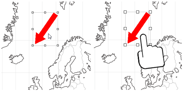
When editing with touch electing objects is important.
The size of the selection blocks change automatically when using a mouse or when using touch to edit an image.
Annotation Functions ImageKit WPF and ImageKit WPF X
ImageKit / ToolBar Standard / ToolBarAnnotation / ToolBarSetpLines / ToolBarSetupObjects controls
Annotate images in the ImageKit
control
The ImageKit control allows you to annotate images
with a variety of annotation objects that display text, lines,
and various shapes on top of the images loaded in the ImageKit control. All
annotation objects can be saved independently of the image they annotate. Saved
annotations can be loaded onto different images. Annotations can be edited
after they are created, they can be moved, reshaped, rotated, etc. Annotations
can be embedded into image files. Annotation methods may be called with code or
used via the new toolbar controls.
Annotate images with the various toolbar controls
Use the new toolbar controls to instantly provide annotation functions to your application! Simply place the toolbar
controls on your form, set them to correspond to the ImageKit Control and thats
it. You can now use any or all annotation functions to edit or annotate your
images, without writing a single line of code!!
ToolBarStandard Control

Provides functions that all annotation objects use and allows basic settings for each annotation object. Loads image files into the ImageKit control and and save image files from the ImageKit control.
 |
Displays the "Open" dialog so you can choose an image file. The image file chosen is loaded and displayed in the ImageKit control. |
 |
Displays the "Save" dialog and saves the image file displayed in the ImageKit control. |
 |
Displays the "Open" dialog so you can choose an annotation file. The annotation file chosen is loaded and the annotation objects are displayed on top of the image in the ImageKit control. |
 |
Displays the "Save" dialog and saves the anntation objects displayed on top of the image in the ImageKit control. The annotation objects are saved in an annotation file. |
 |
Sets the width of the lines and borders for annotation objects |
 |
Displays the color dialog and sets the forecolor in annotation objects. This determines the color of lines, borders, and text. |
 |
Sets the level of opacity for the forecolor used in annotation objects |
 |
Displays the color dialog and sets the background color in annotation objects. |
 |
Sets the level of opacity for the background color used in annotation objects |
 |
Sets whether or not the background color is displayed in annotation objects |
ToolBarAnnotation Control
Sets the type of annotation object, allows each annotation object to be selected and edited.
 |
Selects a single annotation object |
 |
Selects multiple annotation objects within a specified area |
 |
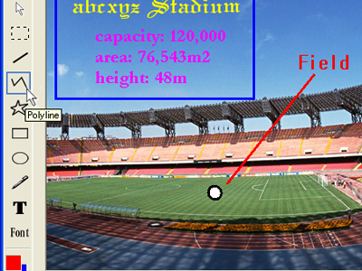
Draws a Line annotation object |
 |
Draws a Polyline annotation object |
 |
Draws a Polygon annotation object |
 |
Draws a Rectangle annotation object |
 |
Draws a Rounded Rectangle annotation object |
 |
Draws an Ellipse annotation object |
 |
Draws an Image annotation object |
 |
Draws a Text annotation object |
 |
Draws a Stamp annotation object |
 |
Selects or deselects all annotation objects displayed in the ImageKit control |
 |
Deletes the selected annotation object(s) |
 |
Cuts the selected annotation object(s) |
 |
Copies the selected annotation object(s) |
 |
Pastes annotation objects that have been cut or copied. The items will be pasted at the location on the ImageKit control where a right click occurred. |
 |
Moves the selected annotation object to the front |
 |
Moves the selected annotation object forward by one object |
 |
Moves the selected annotation object backward by one object |
 |
Moves the selected annotation object to the back |
 |
Removes the last change to the annotation object and returns it to its previous state |
 |
Reverses an undo step |
 |
Displays a dialog that allows the selected object's properties to be changed. |
 |
Embeds the annotation objects into the image displayed in the ImageKit control |
 |
Clears all annotation objects currently drawn in the target ImageKit control |
ToolBarSetupLines Control

Sets properties for Line, Polyline, Polygon, and Pen objects.
 |
Sets wheter or not the Line object will display double lines |
 |
Sets whether or not the start and end points drawn with the Pen object will be connected |
 |
Sets the style of the line drawn |
 |
Sets the style of the cap used for the start of a line |
 |
Sets the style of the cap used for the end of a line |
 |
Sets the style of the join between lines |
 |
Sets whether or not an arrow cap is used at the start of a line |
 |
Sets whether or not the start arrow cap is filled |
 |
Sets the size of the start arrow cap |
 |
Sets whether or not an arrow cap is used at the end of a line |
 |
Sets whether or not the end arrow cap is filled |
 |
Sets the size of the end arrow cap |
ToolBarSetupObjects Control

Sets properties for Rectangle, Rounded Rectangle, Ellipse, Image, Text, and Stamp objects.
 |
Sets whether or not the aspect ratio for Rectangle, RoundRectangle, Ellipse, and Image objects is maintained |
 |
Sets the radius used for the corners of a Rounded Rectangle object |
 |
Sets the font used when text is drawn in the Text and Stamp objects |
 |
Sets whether or not word wrapping is used in Text and Stamp objects |
 |
Sets whether or not text drawn in the Text and Stamp objects is vertical text |
 |
Sets whether or not text in the Text and Stamp objects is displayed from right to left |
 |
Sets whether or not a border is added to the Text or Stamp annotation objects |
 |
Sets the border color used by the Text and Stamp annotation objects |
 |
Sets the level of opacity for the border color of the Text and Stamp annotation objects |
 |
Sets the shape of the border for the Stamp annotation object |
 |
Sets the alignment for the text drawn by the Stamp object |
Draw text, lines, shapes, and other annotation objects
Create straight lines, polylines, polygons, ellipses, pen (free hand lines),
text, etc. Each is a distinct annotation object that can be placed on the
loaded image, displayed, moved, altered, saved to file, or embedded in the
image.

Stamp and rounded rectangles, text color, background color, opacity levels, arrow caps, double lines and other line styles can be set easily!
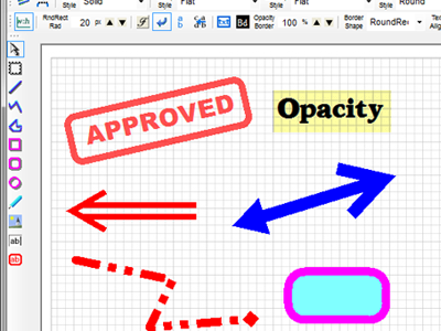
Objects can be drawn by method calls as well as by toolbar. Original toolbar controls can be designed to contain only those functions that you specify.
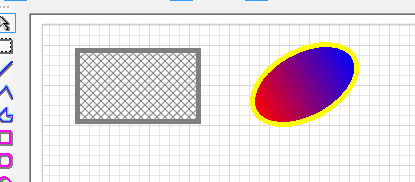
Code example-Enable special fill
ImageKit1.Edit.Fill = True
ImageKit1.Edit.CustomBrushEnabled = True
Code example / hatch pattern
ImageKit1.Edit.BrushKind = KindOfBrush.HatchBrush
ImageKit1.Edit.HatchStyle = HatchStyle.DiagonalCross
ImageKit1.Edit.CustomBrushColor1 = Color.Gray
ImageKit1.Edit.CustomBrushColor2 = Color.Transparent
Code example / Gradation
ImageKit1.Edit.BrushKind = KindOfBrush.LinearGradientBrush
ImageKit1.Edit.CustomBrushColor1 = Color.Red
ImageKit1.Edit.CustomBrushColor2 = Color.Blue
ImageKit1.Edit.LinearGradientMode = LinearGradientMode.Horizontal
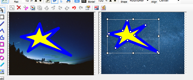
An example of filling a stamp object with a texture brush using the image on the left.
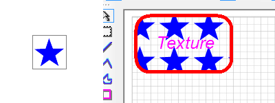
Code example / texture
ImageKit1.Edit.BrushKind = KindOfBrush.TextureBrush
ImageKit1.Edit.CustomBrushImageFileName = "star.png"
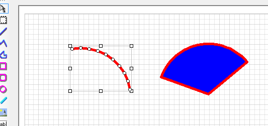
You can also draw arcs and sectors using the method.
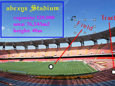
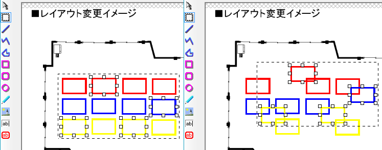
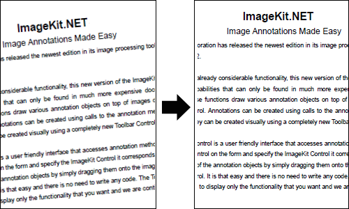
Editing Annotation Objects
After creating annotation objects and placing them on an image, the objects can
be moved, their shapes and contents altered, rotated, and so on.
Copied annotation objects can be pasted into another ImageKit control.
Single points in Polyline, Polygon, and Pen annotation objects can be edited.
In addition to selecting a range by dragging the mouse, the multiple object selection function also supports selecting any object while holding down the Ctrl key.
By right clicking the selected annotation objects context menu is displayed where various annotation and editing functions are available. Any functions available through the toolbar or context menu can also be called independently in the annotation methods.
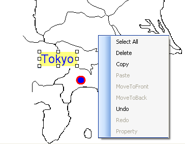
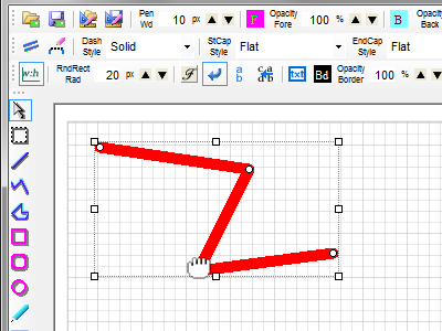
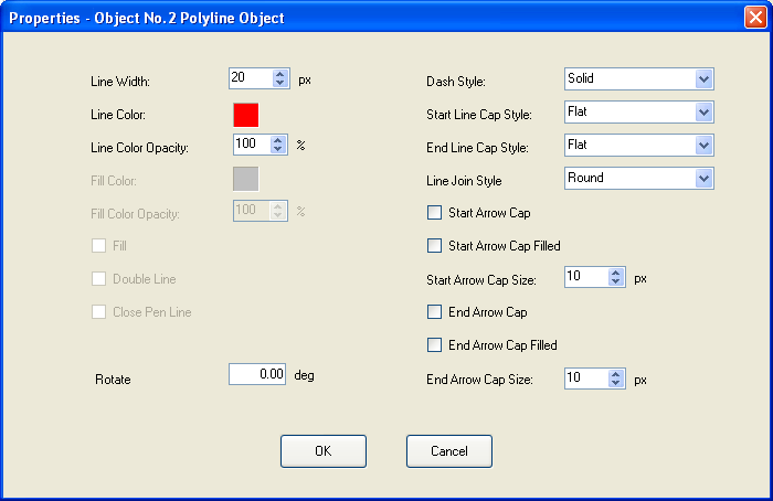
From the Context Menu or from the ToolBarAnnotation toolbar control, you can open the Properties dialog which allows you to edit the annotation object after it has been created. Properties dialog are object specific. Below is an example of the Polyline object's properties dialog.
Saving and Loading the Annotation File
All annotation objects and settings can be saved in an annotation
file that is independent from the image on which the annotations were drawn.
The annotation objects saved in the annotation file can be
loaded again and displayed on any image, not just the image on which they
were originally drawn. Since the annotation file is an xml file, it
is even possible to edit the annotations without loading them by using a text
editor.
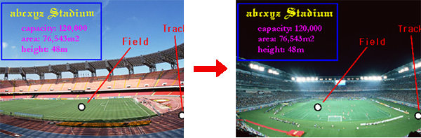
Embed annotations into the image (rasterize
annotations)
All annotation objects drawn on images in the ImageKit Control can be
rasterized and embedded in the image data. The resulting image can be saved in
any format supported by the ImageKit WPF.
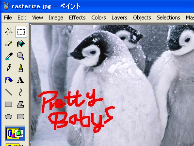
Here is an example of an image with a "Pen" annotation object drawn on it. The annotation has been rasterized and embedded into the image and saved in JPEG format.

Below is a screenshot of this rasterized JPEG image, display in an image viewer.
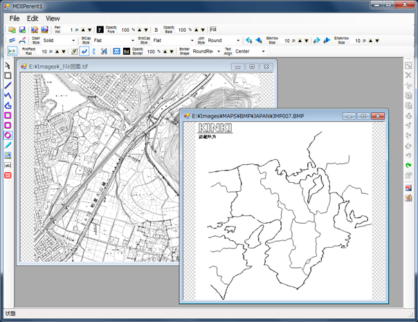
Its easy to use the annotation toolbar controls in MDI forms and other pending software applications.
Not only can you annotation images using the mouse and toolbar controls but you can annotation them with code too. Using properties and methods, draw annotations and edit images seamlessly.
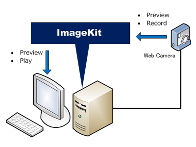
WebCamera Functions ImageKit WPF and ImageKit WPF X
WebCamera Controls
The WebCamera controls provide functions to preview and capture movies in avi, wmv format and to play movies in avi, mpeg, and other formats
The WebCamera Preview Control
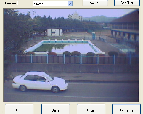
An example of one of the WebCamera's Setting dialogs
Change preview and capture output size by method call!
Displaying images, loading and saving files ImageKit WPF (.NET Framework) only. Not supported by ImageKit WPF X
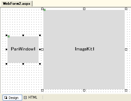
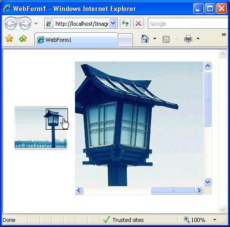
Web ImageKit Control and Web Pan Window Control
Displaying images in the WebForm ImageKit and Pan
Window controls
It is easy to display images in the WebForm ImageKit
control and Pan Window
control. Simply place the controls on the web form and use a few lines of code:
(At Design-time)
(Example code:)
Private Sub Page_Load(ByVal sender As System.Object, ByVal
e As System.EventArgs) Handles MyBase.Load
'set image file name and virtual
path
ImageKit1.Url = "/images/001.jpg"
'load image
ImageKit1.LoadFile(Newtone.ImageKit.LoadFileType.Load)
'display image
ImageKit1.Display(Newtone.ImageKit.Web.DisplayMode.ActualSize)
'specify link to pan
window
ImageKit1.Link = PanWindow1.Link
'display pan window
ImageKit1.ShowPanWindow()
End Sub
(At Run-time)
Use the Web ImageKit Control to load and save images
in WebForm applications
Loading Images ImageKit WPF and ImageKit WPF X
The Web ImageKit control supports the following image formats.
DIB
(Windows BMP) 1, 4, 8, 16, 24, 32 bit
JPEG 8 bit
grayscale (read only), 24 bit color / Standard DCT / Exif (JPEG compression main
image and thumbnail image: read only)
GIF 1, 4, 8
bit
/ transparency / interlace / animation (read only. save single pages possible)
TIFF
1, 4, 8, 16, 24, 32 bit / Compression: Uncompressed / Fax3 (1D) / Fax4 / Packbits / LZW / JPEG (partial support)
/ Color Mode: palette color / RGB / CMYK / Multipage:lLoad and save)
PNG 1, 4, 8,
24 bit
WMF
EMF
Displaying Images ImageKit WPF and ImageKit WPF X
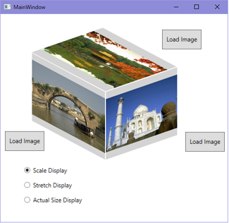
ImageKit Control
Position images in the ImageKit Control
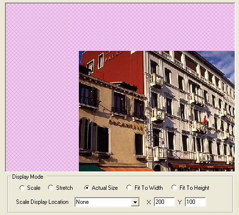
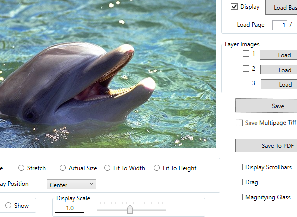
In scale display a small image is centered in the ImageKit Control by default. Now, you can position it anywhere within the ImageKit Control.
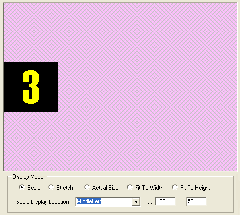
In actual display mode too, even large images can be positioned in the ImageKit Control.
Multi-layer support
It is possible to create applications that simultaneously display JPEG and other raster images along with WMF, EMF or other vector formats.
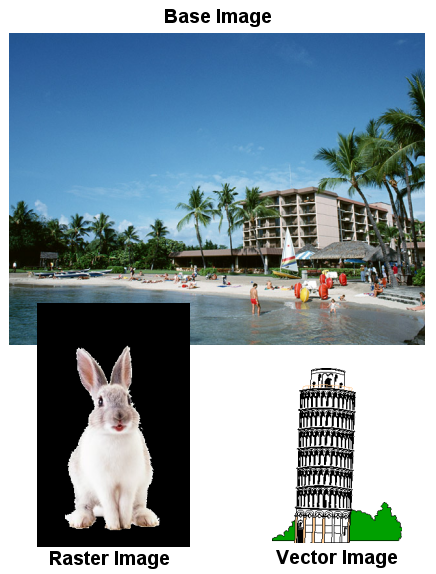
Base Image + Raster Image + Vector Image
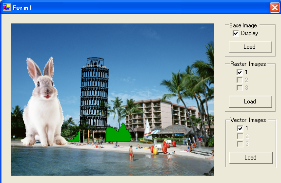
Display vector data (WMF, EMF)
Display multiple raster and vector image
simultaneously in different image layers (support 100 distinct image layers)
Mouse coordinates displayed in tool tip
Scroll displayed image using mouse drag
Display 1 bit color, 4 bit and 8 bit
grayscale images in high quality display.
This overcomes the loss in quality when these images are reduced in size
and displayed.
Scale display
- When the size of the image is larger than the ImageKit Control, the image is
automatically scaled to fit within the ImageKit Control. The height to width
ratio of the original image is maintained.
Actual Size display
- When the image is larger than the ImageKit Control, scroll bars are
automatically enabled and displayed.
Actual Size display (without scroll bars)
- When the image is larger than the ImageKit Control, it is possible to
suppress scoll bars without scaling the image to fit within the ImageKit
Control
Stretch display
- The image is resized to fill the ImageKit Control.
Fit To Width, Fit To Height
- Automatically fits either one of the image dimensions (width or height) to
the ImageKit Control and scales the other dimension.
Initial display position
- Specify where the image will initially be displayed within the ImageKit
Control, for example at the bottom, right.
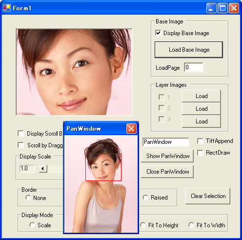
Pan Window (Raster and Vector images)
- The pan window displays the entire image currently being displayed in the
ImageKit Control. That portion of the entire image in the ImageKit Control is
marked with a rectangle in the Pan Window and by moving this rectangle, the
image is scrolled within the ImageKit Control. Multiple images simultaneously
displayed in the ImageKit Control will also be shown in the Pan Window. Both
raster and vector images are supported.
Raster Image Pan Window
Scroll bar control action
- Scroll the image, not only by user interaction, but also by code. You can
even scoll diagonally.
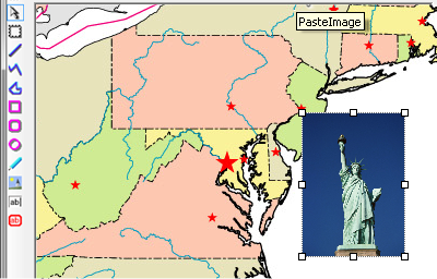
Area Selection
- Select areas by dragging your mouse on the image. Easily pass these
coordinates to the Effect interface to apply effect filters, transformations,
or to paste into another image, etc.
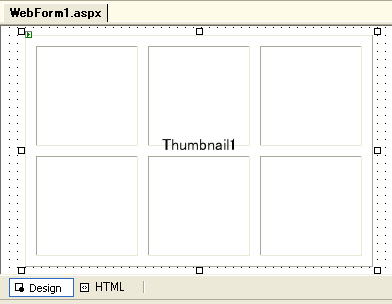
Thumbnail Control ImageKit WPF (.NET Framework) only. Not supported by ImageKit WPF X
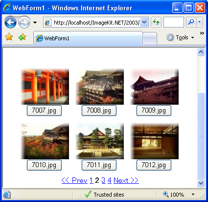
The ImageKit Web Thumbnail control is a server side web control creates thumbnail images and displays them in the browers. Simply setting the directory where the original images reside and setting the directory where the thumbnail images will be created is all that is necessary. The thumbnails can be clicked to display the original images, buttons or links can be displayed, and paging can be used.
Thumbnail Control at design-time:
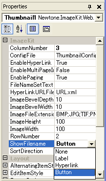
Thumbnail Control Property Page:
Sample code:
Private Sub Page_Load(ByVal sender As System.Object, ByVal
e As System.EventArgs) Handles MyBase.Load
If IsPostBack = False Then
'set the virtual path to the directory
containing the images
you want to display
Thumbnail1.ImageDirectory = "/ImagesIK/1"
Thumbnail1.ThumbnailImageDirectory =
"/ImagesIK/1/ThumbnailImages"
Thumbnail1.ShowThumbnailImages()
End If
End Sub
Thumbnail Control at run-time:
Thumbnail Control ImageKit WPF and ImageKit WPF X
WPF Thumbnail Control lets you display images as thumbnails by simply selecting the image folder and the file type you want to display. The Thumbnail control automatically displays all image files of that type as thumbnails. It is an easy to use, fast, customizable control.
WPF Thumbnail Control
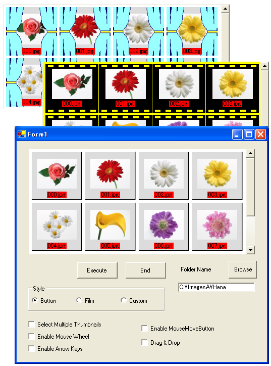
Direct control over thumbnail display order
To change the order of the thumbnail images currently displayed in the
Thumbnail Control, simply drag the thumbnail with the mouse until it is in the
proper position.
Delete a thumbnail
With the Delete Method, you can remove a thumbnail by specifying the image
number.
Change the layout of the thumbnail dialog
You can specify the number of columns and rows of thumbnails that will be
displayed within the control as well as the gap size, etc.
Abundant thumbnail settings
Thumbnail settings include: folder, file types (BMP, JPG, GIF, etc., load
and mix different file types), number of columns, number of rows, scrollbar
on/off, scroll action (scroll using code), background colors, display size, gap
size, display pattern (film, button, custom), et.al.
Generates file load events
When image files are loaded and displayed as thumbnails, events are generated
and can be used to execute code for each file loaded.
Supports the display of custom patterns
Create you own pattern when thumbnails are displayed. Simply specify the
pattern images and set transparent colors.
Simultaneous thumbnail selection
Supports the selection of multiple thumbnail images at the same time.
Drag and drop
Drag images from Windows Explorer or from another ImageKit Thumbnail Control
and drop them directly into the Thumbnail Control.
Increase speed in displaying thumbnail image
Load images into the Thumbnail Control once and then, by using the ImageKit Thumbnail File, greatly increase the display speed whenever they are loaded
again.
Image Effects and Transformations ImageKit WPF and ImageKit WPF X
ImageKit Control
Provides numerous effect filters and transformation functions for processing images.
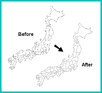
Deskew Images!
When a scanned image or an image saved to file is skewed, use
the deskew function to repair it!
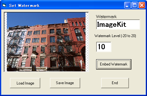
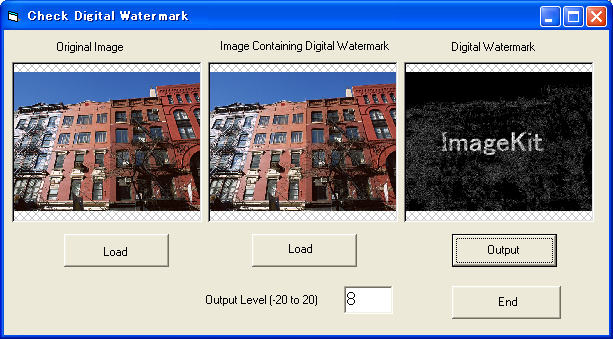
Digital Watermark
Embed an "invisible" copyright or logo within an image and be
able to detect it later.
Embedding an digital watermark
Checking for the watermark in an image
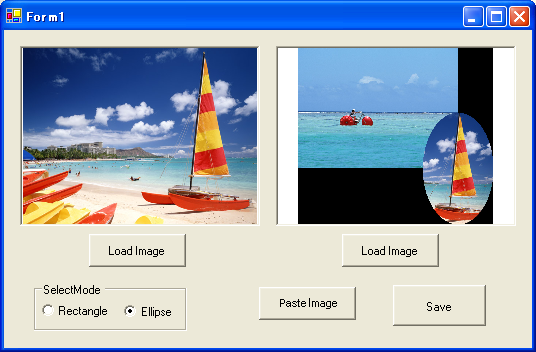
Create new images Select regions in the image for processing
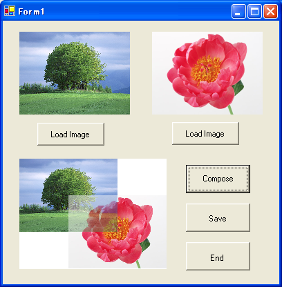
Combine Images
Paste images together or layer images on top of each other. You can set
attachment location, set overall transparency, specify a transparent color,
clip excess, flip, mirror, etc.
An example of two images layered with 50% overall transparency
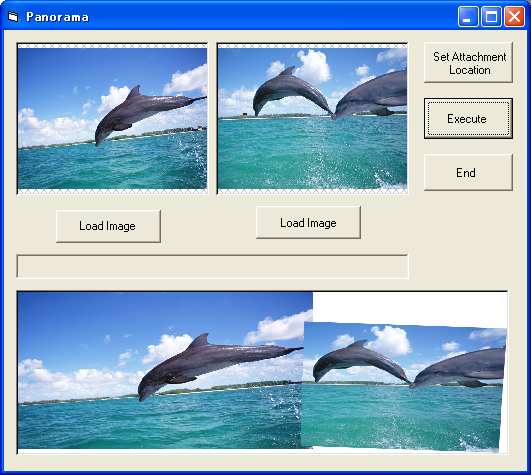
Panorama Composition
This creates a panorama out of two raster images. By simply specifying two
attachment locations on each image, creates a panorama. You can specify the
direction images are attached, specify the background color for areas outside
the images, set a string displayed in the title bar of the panorama, etc.
Area Selection and Paste Sample
Effects Sample
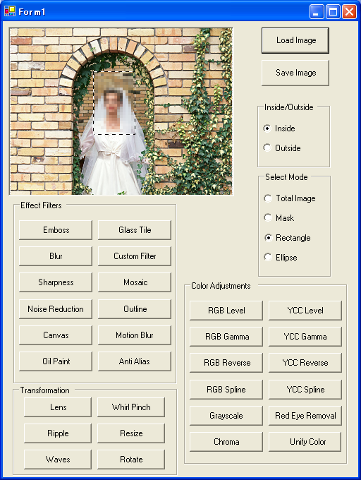
Increasing / Decreasing Color Sample
Duplicate images
Copy and paste images to clipboard
Adjust sharpness
Noise reduction
Blur Mosiac
Outline Emboss
Antialias Glasstile
Color correction (RGB, YCC support; Gamma, Level, and
Chroma adjustment) Increase or decrease color
Resize Rotate (regional area selection possible; 1/100th of a
degree accuracy; interpolation reduces deterioration of rotated
object) Flip Mirror
Affine correction (deskew)
Special effects
Oilpaint, canvas, glasstile, lens, ripple, whirlpinch, waves, motionblur, and
more...
Wave Effect


Canvas Effect


Motionblur Effect


Whirlpinch Effect


Image scanning and retrieval ImageKit WPF and ImageKit WPF X
ImageKit Control
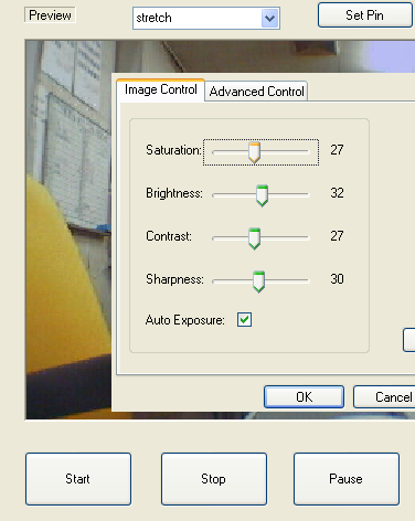
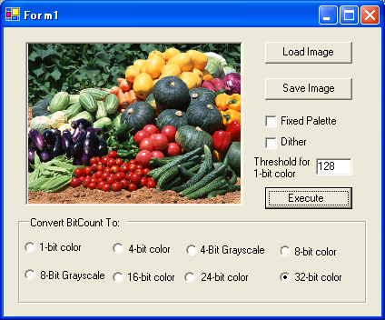
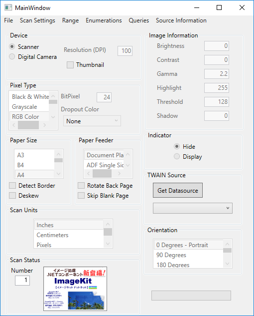
ImageKit WPF and ImageKit WPF X allow you to add scanning functions to your applications quickly and easily. Retrieve images from TWAIN scan devices - scanners, digital cameras, film scanners. Use the scan manufacturer's user interface or build your own custom user interface making scanning a nearly seamless operation. Set scan conditions, pixel type, resolution, bit count, brightness, contrast, highlight, threshold, shadow, enable/disable scan indicator, scan mode, datasource name, scan position, scan units, and more. Of course ADF and duplex scanning is supported.
A screenshot of our Scan sample and its menu items
Support for memory transfer with compression (JPEG,
PNG)
Support for file transfer
Set and retrieve the compression method for file and memory transfer.
Compression methods include: Uncompressed (default), Packbits, Group3-1D,
Group3-1DEOL, Group3-2D, Group4, Jpeg, Lzw, Jbig, Png, Rle4, Rle8, Bitfields
Support for dropout color
This sets the dropout color when using a custom-built scan interface.
Support for noise filter
Reduces noise in black and white (1-bit color) images.
Support for image filter
Improves image quality. LOWPASS improves halftone images, BANDPASS improves
images that include text, and HIGHPASS improves images that have lines.
Auto paper size detection
When paper size is set to "undefined" (1000), this function automatically
detects the size of the paper and scans.
Support for deskew
Corrects skewed documents
Support for moire filter (Canon
DR Scanners) (Epson
Scanners)
Sets the moire Filter when scanning with a custom-built scan interface
Support for unsharpness filter (Epson
Scanners)
Sets the Epson Unsharpness Filter when scanning with a custom-built scan
interface
Support for dynamic threshold (Panasonic
Scanners)
Improves clarity and reduces "smudginess" when scanning with a custom-built
scan interface
Support for deskew smoothing (Panasonic
Scanners)
Significantly reduces jagged lines and text
Auto Color/B&W Detection (Canon
DR Scanners) (Epson
Scanners) (Panasonic
Scanners)
Significantly reduces jagged lines and text
Multistream support (Panasonic
Scanners)
Outputs two types of images simultaneously either Color/B&W or
Grayscale/B&W
Punch hole removal (Canon
DR Scanners) (Epson
Scanners) (Panasonic
Scanners)
Gamma Correction (Epson
Scanners)
Detect Blank Page
Overscan Support
ADF
duplex scanning support
Retrieve thumbnail images from digital cameras
Supports monochrome halftone settings
Supports scaling
Set
paper size when scanning
Retrieve the range of setting values for a give scan
property
Select the scan device
Displays a dialog that allows you to select the scan device you wish to use
from all the scan devices installed. If you know the scan device's datasource
name, you can shortcut this functionality and directly initialize the scan
device. It is also possible to retrieve the datasource list displayed in the
dialog.
Supports both scanner manufacturer's UI and custom built
UI
Not only supports scan user interface provided by the scanner manufacturer but
also supports the custom scan user interface that you build.
Supports continuous scanning with ADF (auto document
feeder) or digital camera. (both manufacturer and custom UI)
Provides functions to set scanning conditions (custom UI)
and retrieve scan information (both manufacturer and custom UI)
Scanning Conditons include: pixel type, scan location,
resolution, image bitcount, brightness, contrast, gamma correction, highlight,
threshold, shadow, scan indicator on/off, scan mode (document plate, ADF,
digital camera, etc.), specify datasource name, select user interface (use
manufacturer UI, use manufacturer UI and close after scan, use custom UI), scan
units (inches, centimeters, pixels...)
Scanning Information includes: scan location, resolution, scan
units (inches, centimeters, pixels...)
Provides events that you can hook into for each scan even
when using continuous scanning via ADF or digital camera.
File processing functions ImageKit WPF and ImageKit WPF X
ImageKit Control
The ImageKit Control provides you with numerous functions for loading and saving image files. Of course, load functions for each file type are provided but there is also a load function that automatically detects each file type. Load files of one type and save them as a different type.
Multipage Tiff functions
Images can be saved in multipage tiff files. Images can be appended to a multipage file, inserted into a multipage file, and specified pages deleted from a multipage file using methods provided.
The Open file dialog
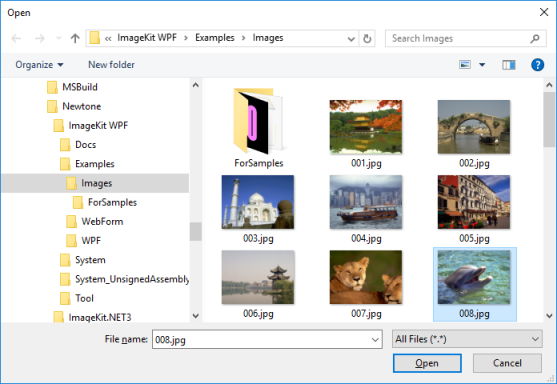
By using this dialog, you no longer need any code to select images files to load.
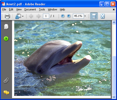
Save images to PDF Document
Save BMP or JPEG images in PDF documents using these easy to use steps: start a pdf document; add a page; add images to the page in specified locations; end the page; and end the document.
Saving an image in PDF with the ImageKit WPF
The resulting pdf document displayed in Adobe Reader
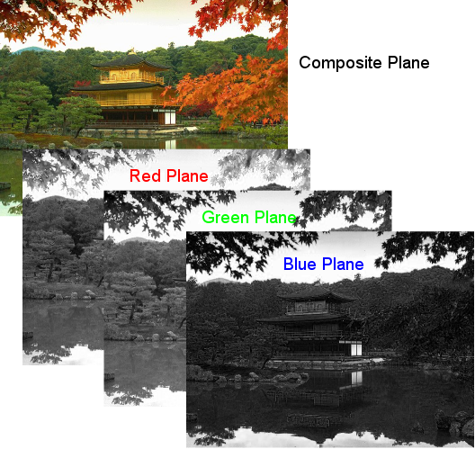
Load images from and save images to separate color
planes
With the following methods, images can be separated into their respective color
planes and saved. Likewise, images can be loaded from their respective color
planes.
RGBBmpPlaneFileLoad / RGBBmpPlaneFileSave
CMYKBmpPlaneFileLoad / CMYKBmpPlaneFileSave
YCCBmpPlaneFileLoad / YCCBmpPlaneFileSave
Load images from and save images to memory
data
FTP and HTTP File Transfer methods
Easy to use Ftp and Http file transfer methods
Image data in byte array can now be transferred
Progress event generated when loading and saving
Image Formats ImageKit WPF and ImageKit WPF X
The ImageKit WPF and ImageKit WPF X Controls support the following image formats.
DIB
(Windows BMP) 1, 4, 8, 16, 24, 32 bit
JPEG 8 bit
grayscale (read only), 24 bit color / Standard DCT / Exif (JPEG compression main
image and thumbnail image: read only)
GIF 1, 4, 8
bit
/ transparency / interlace / animation (read only. save single pages possible)
TIFF
1, 4, 8, 16, 24, 32 bit / Compression: Uncompressed / Fax3 (1D) / Fax4 / Packbits / LZW / JPEG (partial support)
/ Color Mode: palette color / RGB / CMYK / Multipage:lLoad and save)
PNG 1, 4, 8,
24 bit
WMF
EMF
ImageKit WPF / ImageKit WPF X PC Developer License
The ImageKit WPF and ImageKit WPF X are licensed as a PC Developer License which means that a Separate license is required for each computer where the
ImageKit WPF / WPF X is used to develop software. The PC Developer License allows you to use the ImageKit WPF
or ImageKit WPF X to create application software that contains ImageKit WPF /
ImageKit WPF X functionality and exposes this functionality in a runtime environment. The PC Developer License is activated by completing your user registration. The PC Developer License is a perpetual license. It does not expire.
How many PC Developer Licenses do I need? An Example:
If the ImageKit WPF /
WPF X is used by only one person on one computer, then only one
license is required.
If the ImageKit WPF / WPF X is used by only one person, but this person uses it on two
computers, then 2 PC developer licenses are required.
If two software developers use the ImageKit WPF / WPF X but only on one computer,
then only one license is required.
For software developers who require multiple licenses, we have multiple license packs available at a significant discount.
For more details about licensing, please refer to our licensing page or contact us at sales@imagekit.com.
ImageKit WPF / ImageKit WPF X License Activation
For the ImageKit WPF / WPF X to work properly, the license must be activated. License activation insures that the correct number of licenses are properly installed. Activation usually takes place when the ImageKit WPF / WPF X is installed but activation can be postponed until later. In the license is not activated within 2 weeks of installation, the ImageKit WPF will stop working until it is activated. License activation is simply and takes only a few seconds online. Activation can also be performed offline. For more information about license activation, please refer to the ImageKit WPF / WPF X documentation or contact us at sales@imagekit.com.
ImageKit WPF / ImageKit WPF X Runtime Distribution License
The ImageKit WPF / ImageKit WPF X Runtime Distribution License is included free with the PC Developer License. The Runtime Distribution License allows the license holder to distribute the runtime applications that they have made that contain ImageKit WPF / ImageKit WPF X functionality. The valid runtime distribution license holder can make and distribute application software (executable) without limit.* The license holder must be a registered user of the ImageKit WPF / WPF X. Only registered users are allowed to do this. To register, simply send us your contact information along with the serial number of the ImageKit WPF / ImageKit WPF X that you are using to register@imagekit.com. For more information, please visit our user registration page.
*This does not apply to servers. Applications running on a server require an
ImageKit WPF or ImageKit WPF X Server Runtime License.
For details please contact sales@imagekit.com
The ImageKit WPF / ImageKit WPF X can only be registered to the person using it. It cannot be registered to a company, a group, or any other entity. USER REGISTRATION IS NOT TRANSFERRABLE WITHOUT THE EXPRESSED WRITTEN CONSENT OF NEWTONE CORPORATION.
Subscription for Support Services
The ImageKit WPF / ImageKit WPF X PC Developer License includes a one-year subscription for support services. The subscription for support services is an annual subscription program. All customers who participate in the subscription program have access to support and all minor and major version updates for the ImageKit WPF / ImageKit WPF X. Updates for the ImageKit WPF / ImageKit WPF X include but are not limited to additions of new functionality, improvements in existing functionality, bug fixes, maintenance releases, etc. Holders of a valid subscription are entitled to receive technical support via email for the duration of the subscription period. The subscription term is for one year that starts from the date of purchase. Please take advantage of these support services.
Subscription renewals are entirely optional. If you choose not to renew your subscription, you may still use the ImageKit WPF / ImageKit WPF X as it is. Your PC Developer License and Runtime Distribution License are perpetual licenses that do not expire. They are unrelated to whether or not you have a valid subscription for support services.
Suggested Retail Price
ImageKit WPF PC
Developer License US$799.00
(1 Single PC Developer License, includes a one-year subscription)
ImageKit WPF X PC
Developer License US$799.00
(1 Single PC Developer License, includes a one-year subscription)
ImageKit WPF Server Runtime License US$399.00
(1 Single Web Server License)
ImageKit WPF X Server Runtime License US$399.00
(1 Single Web Server License)
ImageKit WPF PC Subscription Renewal
US$399.00
(1 PC
Annual Subscription Renewal)
ImageKit WPF X PC Subscription Renewal
US$399.00
(1 PC
Annual Subscription Renewal)
Multiple licenses packs are available at a significant discount.
For details, please see ImageKit WPF and ImageKit WPF X Multiple License Packs or visit our
online store
Supported Environment
Supported
Platform
Microsoft Windows
11 / 10 / 8.1 / 8 / 7 (*1) / Server 2022 / 2019 / 2016 / 2012 R2 / 2012 / 2008 R2
(*1)
(*1) ImageKit WPF versions 1.1.3.042 or earlier
64 bit Operating Systems are supported
Supported .NET
Framework
ImageKit WPF: .NET Framework 4.8 / 4.7.2 / 4.7.1 / 4.7 / 4.6.2 / 4.6.1 / 4.6 / 4.5.2 / 4.5.1 /4.5
ImageKit WPF X (*2):
.NET 9.0(*5), .NET 8.0 (*4), .NET 7.0 (*3), .NET 6.0, .NET 5.0
(*2) Only Windows Presentation Foundation client applications can be created with ImageKit WPF X
(*3) Version 7.0.0.20 or later
(*4) Version 8.0.0.22 or later
(*5) Version 9.0.1.05 or later
Supported Development Container
ImageKit WPF: Visual Studio 2022 / 2019 / 2017 / 2015 / 2013 / 2012, IIS 10.0 / 8.5 / 8.0 / 7.5 / 7.0
ImageKit WPF X: Visual Studio 2022/ 2019 version 16.8 or later
Supported Scan Devices (TWAIN ONLY)
Image Scanners (+ADF) / Digital Cameras / Flim Scanners
DirectX
DirectX 9 and above (This is required for the WebCamera Control)
