ImageKit® New Feature List
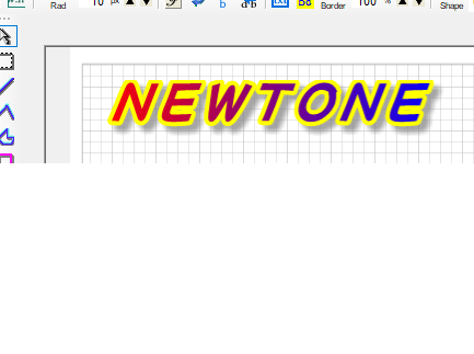
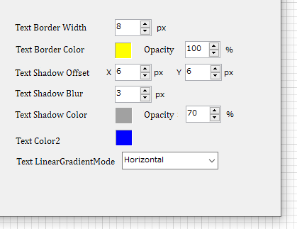
Drawing text with borders, shadows, and gradients in text and stamp objects (2022.9)
The properties allow detailed settings for each element, including blurring of shadows and semi-transparency.
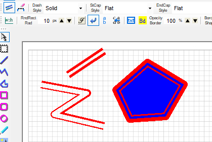
Double lines, adjustable line width and spacing in Line, Polyline, Polygon, and Pen objects (2022.7)
Line width and spacing can also be adjusted using property values.
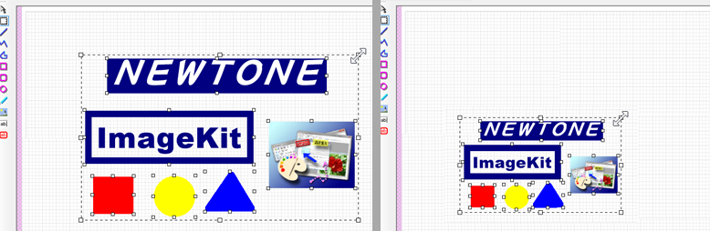
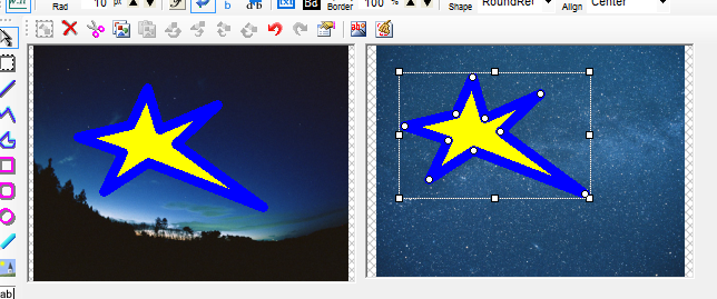
Zoom in and zoom out when multiple annotation objects are selected (2021.9)
All selected objects can be enlarged or reduced at the same time while maintaining their relative positions.
The aspect ratio of all selected objects can also be maintained.
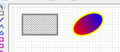
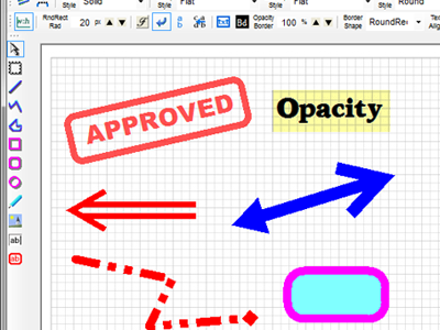
Special fill patterns are supported in annotation objects (2019.3)
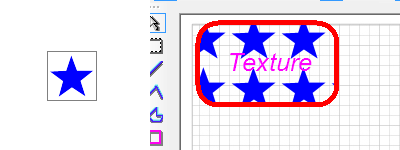
Objects can be filled not only with a single color, but also with special patterns such as hatch patterns, gradients, and textures.
Example of filling with a hatch pattern and gradient. Transparent colors can also be used.
Here is an example of using the image on the left to fill a stamp object with a texture brush.
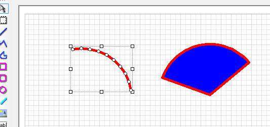
Added methods to easily draw arcs and fans (2018.5)
These new methods also makes it easy to draw arcs and fans.
Support for saving images in Tiff Jpeg format (2017.6)
The file saving now supports saving in TiffJpeg format. (* Only 24-bit images will be saved regardless of the number of bits in the loaded image.)
Select multiple annotation objects by holding down the Ctrl key (2017.3)
When selecting multiple annotation objects, in addition to selecting objects by dragging the mouse, multiple objects can be selected by holding down the Ctrl key.
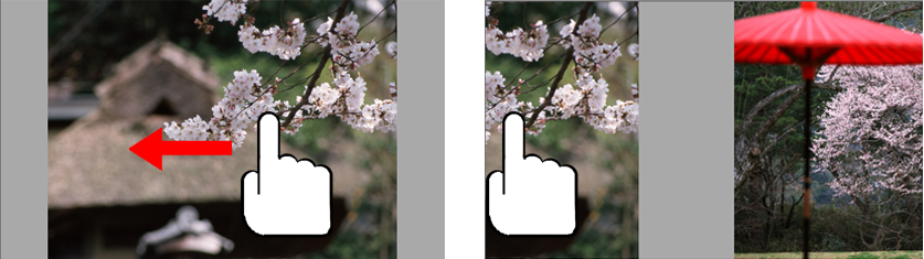
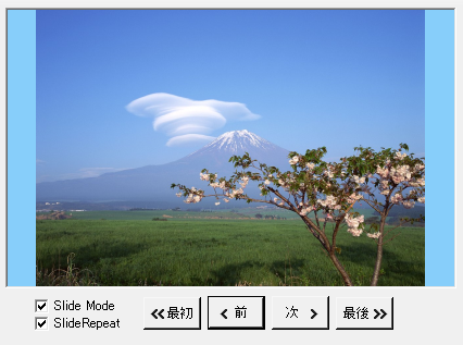
Slide control functionality and swipe/flick operation support for ImageKit controls (2016.10)
ImageKit controls can now be used as slide controls.
Images can be swiped or filcked using touch, dragging with the mouse, or pressing a button.
It is also possible to pinch in/out or drag to return to normal view in the middle of a slide.
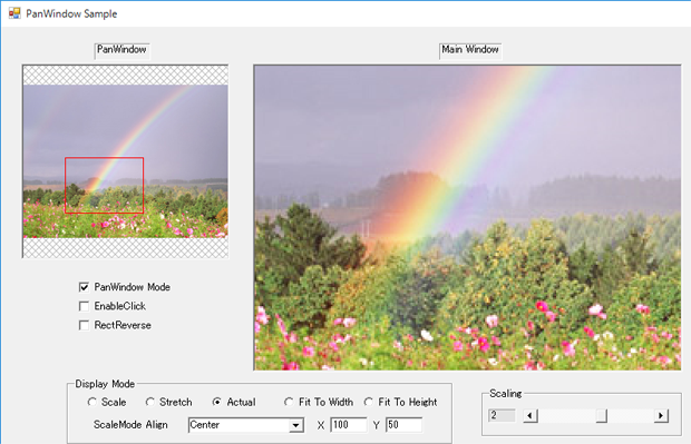
New pan-window functionality for ImageKit controls (2016.1)
ImageKit controls can now be used as pan windows. This allows you to paste two ImageKit controls on one form and use one as a pan window instead of a separate window.
Touch
Touch functionality has been implemented for use with tablet PCs.
Pinch in, pinch out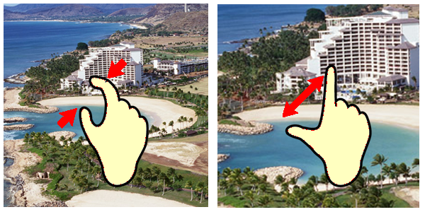
Drag image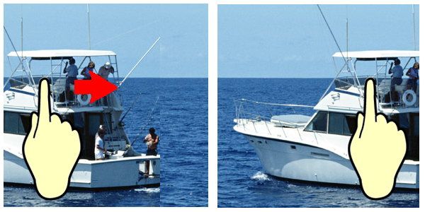
Touch support in editing functions
The size of the editing block is automatically changed between mouse and touch operation for ease of operation by touch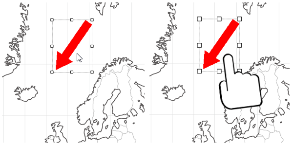
Scrolling thumbnails and image reordering
The thumbnail control supports reordering of images by scrolling or dragging
Annotation Functions
Significant additions and improvements have been made to the annotation function, which allows users to insert annotation text, draw lines and shapes, and paste images onto imported images.
Annotate images in the ImageKit
control
The ImageKit control allows you to annotate images
with a variety of annotation objects that display text, lines,
and various shapes on top of the images loaded in the ImageKit control. All
annotation objects can be saved independently of the image they annotate. Saved
annotations can be loaded onto different images. Annotations can be edited
after they are created, they can be moved, reshaped, rotated, etc. Annotations
can be embedded into image files. Annotation methods may be called with code or
used via the toolbar controls.
Annotate images with the various toolbar controls
Use the new toolbar controls to instantly provide annotation functions to your application! Simply place the toolbar
controls on your form, set them to correspond to the ImageKit Control and thats
it. You can now use any or all annotation functions to edit or annotate your
images, without writing a single line of code!!
ToolBarStandard Control

Provides functions that all annotation objects use and allows basic settings for each annotation object. Loads image files into the ImageKit control and and save image files from the ImageKit control.
 |
Displays the "Open" dialog so you can choose an image file. The image file chosen is loaded and displayed in the ImageKit control. |
 |
Displays the "Save" dialog and saves the image file displayed in the ImageKit control. |
 |
Displays the "Open" dialog so you can choose an annotation file. The annotation file chosen is loaded and the annotation objects are displayed on top of the image in the ImageKit control. |
 |
Displays the "Save" dialog and saves the anntation objects displayed on top of the image in the ImageKit control. The annotation objects are saved in an annotation file. |
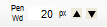 |
Sets the width of the lines and borders for annotation objects |
 |
Displays the color dialog and sets the forecolor in annotation objects. This determines the color of lines, borders, and text. |
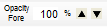 |
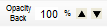
Sets the level of opacity for the forecolor used in annotation objects |
 |
Displays the color dialog and sets the background color in annotation objects. |
 |
Sets the level of opacity for the background color used in annotation objects |
 |
Sets whether or not the background color is displayed in annotation objects |
ToolBarAnnotation Control

Sets the type of annotation object, allows each annotation object to be selected and edited.
 |
Selects a single annotation object |
 |
Selects multiple annotation objects within a specified area |
 |
Draws a Line annotation object |
 |
Draws a Polyline annotation object |
 |
Draws a Polygon annotation object |
 |
Draws a Rectangle annotation object |
 |
Draws a Rounded Rectangle annotation object |
 |
Draws an Ellipse annotation object |
 |
Draws an Image annotation object |
 |
Draws a Text annotation object |
 |
Draws a Stamp annotation object |
 |
Selects or deselects all annotation objects displayed in the ImageKit control |
 |
Deletes the selected annotation object(s) |
 |
Cuts the selected annotation object(s) |
 |
Copies the selected annotation object(s) |
 |
Pastes annotation objects that have been cut or copied. The items will be pasted at the location on the ImageKit control where a right click occurred. |
 |
Moves the selected annotation object to the front |
 |
Moves the selected annotation object forward by one object |
 |
Moves the selected annotation object backward by one object |
 |
Moves the selected annotation object to the back |
 |
Removes the last change to the annotation object and returns it to its previous state |
 |
Reverses an undo step |
 |
Displays a dialog that allows the selected object's properties to be changed. |
 |
Embeds the annotation objects into the image displayed in the ImageKit control |
 |
Clears all annotation objects currently drawn in the target ImageKit control |
ToolBarSetupLines Control

Sets properties for Line, Polyline, Polygon, and Pen objects.
 |
Sets wheter or not the Line object will display double lines |
 |
Sets whether or not the start and end points drawn with the Pen object will be connected |
 |
Sets the style of the line drawn |
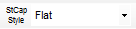 |
Sets the style of the cap used for the start of a line |
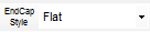 |
Sets the style of the cap used for the end of a line |
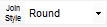 |
Sets the style of the join between lines |
 |
Sets whether or not an arrow cap is used at the start of a line |
 |
Sets whether or not the start arrow cap is filled |
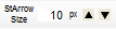 |
Sets the size of the start arrow cap |
 |
Sets whether or not an arrow cap is used at the end of a line |
 |
Sets whether or not the end arrow cap is filled |
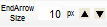 |
Sets the size of the end arrow cap |
ToolBarSetupObjects Control

Sets properties for Rectangle, Rounded Rectangle, Ellipse, Image, Text, and Stamp objects.
 |
Sets whether or not the aspect ratio for Rectangle, RoundRectangle, Ellipse, and Image objects is maintained |
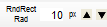 |
Sets the radius used for the corners of a Rounded Rectangle object |
 |
Sets the font used when text is drawn in the Text and Stamp objects |
 |
Sets whether or not word wrapping is used in Text and Stamp objects |
 |
Sets whether or not text drawn in the Text and Stamp objects is vertical text |
 |
Sets whether or not text in the Text and Stamp objects is displayed from right to left |
 |
Sets whether or not a border is added to the Text or Stamp annotation objects |
 |
Sets the border color used by the Text and Stamp annotation objects |
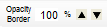 |
Sets the level of opacity for the border color of the Text and Stamp annotation objects |
 |
Sets the shape of the border for the Stamp annotation object |
 |
Sets the alignment for the text drawn by the Stamp object |
Stamp objects, rounded rectangle objects, opacity settings for text, background, and border colors, arrows, double lines, cap style, dashed line style, and joining style settings are also available.
Copied annotation objects can be pasted into another ImageKit control.
WebCamera Functions
Web camera functions have been enhanced.
Capture function newly supports WMV format.
Output size can be changed by method in the preview and capture functions.
Image scanning
Scanning functions have also been further enhanced.
64-bit TWAIN driver support
TWAIN-compatible devices such as scanners can now be used with 64-bit applications.
Retention of TWAIN driver UI information & scanning using that information
Support for reading positive film of transparencies (developer-created UI), and for making text clear [EPSON scanners]
Support for text enhancement [Canon DR scanners]
Duplex merging when two sides of an ADF sheet are imported
Border correction [EPSON scanners]
Border deletion [Panasonic scanners]
Image Effects
New methods have been added to the effects function as well.
Added methods to adjust brightness and contrast
File Functions
Multi-Tiff File Saving and Editing
Tiff images can now be easily added to, inserted into, or deleted from a multi-tiff file using the respective methods.
File Handling Plug-ins Now Support 64-Bit
The included plug-ins for file processing are now 64-bit compatible, allowing the plug-ins to be used in 64-bit applications.
