There are four types of ToolBar controls which you can use in combination with the ImageKit control by pasting them into a Windows Form. Associate the ImageKit control with the TargetImageKit property of each ToolBar.
With these ToolBars, you can take advantage of various annotation features without writing any code.
The types of ToolBars and the functions that each ToolBar has are as follows:
ToolBarStandard
A toolbar control with buttons that allow you to make basic
settings for the editing and annotation functions of the ImageKit
control.
It is possible to make basic settings related to editing and
annotation of the target ImageKit control.
It also includes a button that has a function to read and save
image files.

The ToolBarStandard control contains the following elements:
- File Related
 The "Open Image File"
button: Opens and displays the image file in the target ImageKit
control. You can achieve a series of actions similar to executing
the ImageKit.File.LoadImageFromFile
method.
The "Open Image File"
button: Opens and displays the image file in the target ImageKit
control. You can achieve a series of actions similar to executing
the ImageKit.File.LoadImageFromFile
method. The "Save Image File"
button: Saves the image displayed in the target ImageKit control to
a file. You can achieve a series of actions similar to executing
the ImageKit.File.SaveImageToFile
method.
The "Save Image File"
button: Saves the image displayed in the target ImageKit control to
a file. You can achieve a series of actions similar to executing
the ImageKit.File.SaveImageToFile
method.
- Annotation file related
 The "Open Annotation
File" button: Opens the annotation file, reads the edit /
annotation information and displayed in the target ImageKit
control. You can achieve the same behavior as executing the
ImageKit.Edit.LoadAnnotationFile method.
The "Open Annotation
File" button: Opens the annotation file, reads the edit /
annotation information and displayed in the target ImageKit
control. You can achieve the same behavior as executing the
ImageKit.Edit.LoadAnnotationFile method. The "Save Annotation
File" button: Saves the edit / annotation information drawn on the
target ImageKit control to the annotation file. You can achieve the
same behavior as executing the ImageKit.Edit.SaveAnnotationFile
method.
The "Save Annotation
File" button: Saves the edit / annotation information drawn on the
target ImageKit control to the annotation file. You can achieve the
same behavior as executing the ImageKit.Edit.SaveAnnotationFile
method.
- Annotation Related Basic Settings
 The "Line / Border
Thickness Setting" box / button: Enter values directly into the
textbox or press arrows to increase / decrease the value, this sets
the value of the ImageKit control's ImageKit.Edit.PenWidth property.
The "Line / Border
Thickness Setting" box / button: Enter values directly into the
textbox or press arrows to increase / decrease the value, this sets
the value of the ImageKit control's ImageKit.Edit.PenWidth property. The "Line / Text Color"
button: Displays the color dialog of the target ImageKit control
and sets the ImageKit.Edit.ForeColor
property. The set color will be the button color.
The "Line / Text Color"
button: Displays the color dialog of the target ImageKit control
and sets the ImageKit.Edit.ForeColor
property. The set color will be the button color.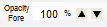 The "Line / Text Color
Opacity" box / button: Enter values directly in the textbox or
press arrows to increase / decrease the value, this sets the value
of the ImageKit control's ImageKit.Edit.ForeColorOpacity
property.
The "Line / Text Color
Opacity" box / button: Enter values directly in the textbox or
press arrows to increase / decrease the value, this sets the value
of the ImageKit control's ImageKit.Edit.ForeColorOpacity
property. The "Background Color"
button: Displays the color dialog of the target ImageKit control
and sets the ImageKit.Edit.BackColor
property. The set color will be the button color.
The "Background Color"
button: Displays the color dialog of the target ImageKit control
and sets the ImageKit.Edit.BackColor
property. The set color will be the button color.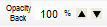 The "Background Color
Opacity" Box / Button: Enter values directly into the textbox or
press arrows to increase / decrease the value, this sets the value
of the ImageKit control's ImageKit.Edit.BackColorOpacity
property.
The "Background Color
Opacity" Box / Button: Enter values directly into the textbox or
press arrows to increase / decrease the value, this sets the value
of the ImageKit control's ImageKit.Edit.BackColorOpacity
property. The"Fill" button: Sets
the ImageKit control's ImageKit.Edit.Fill
property. True / False is indicated by whether or not the button is
pressed.
The"Fill" button: Sets
the ImageKit control's ImageKit.Edit.Fill
property. True / False is indicated by whether or not the button is
pressed.
ToolBarAnnotation
It is a toolbar control with buttons that can operate the editing and annotation functions of the ImageKit control.
You can edit and annotate the target ImageKit control.

The ToolBarAnnotation control contains the following elements:
- Annotation Related Items
 The "Select" button:
Sets the target ImageKit control's ImageKit.Edit.EditKind property to KindOfEdit.Select.
The "Select" button:
Sets the target ImageKit control's ImageKit.Edit.EditKind property to KindOfEdit.Select. The "MultiSelect"
button: Sets the target ImageKit control's ImageKit.Edit.EditKind property to KindOfEdit.MultiSelect.
The "MultiSelect"
button: Sets the target ImageKit control's ImageKit.Edit.EditKind property to KindOfEdit.MultiSelect. The "Line" button:
Sets the target ImageKit control's ImageKit.Edit.EditKind property to KindOfEdit.Line.
The "Line" button:
Sets the target ImageKit control's ImageKit.Edit.EditKind property to KindOfEdit.Line. The "Polyline"
button: Sets the target ImageKit control's ImageKit.Edit.EditKind property to KindOfEdit.Polyline.
The "Polyline"
button: Sets the target ImageKit control's ImageKit.Edit.EditKind property to KindOfEdit.Polyline. The "Polygon"
button: Sets the target ImageKit control's ImageKit.Edit.EditKind property to KindOfEdit.Polygon.
The "Polygon"
button: Sets the target ImageKit control's ImageKit.Edit.EditKind property to KindOfEdit.Polygon. The "Rectangle"
button: Sets the target ImageKit control's ImageKit.Edit.EditKind property to KindOfEdit.Rectangle.
The "Rectangle"
button: Sets the target ImageKit control's ImageKit.Edit.EditKind property to KindOfEdit.Rectangle. The "RoundRectangle"
button: Sets the target ImageKit control's ImageKit.Edit.EditKind property to KindOfEdit.RoundRectangle.
The "RoundRectangle"
button: Sets the target ImageKit control's ImageKit.Edit.EditKind property to KindOfEdit.RoundRectangle. The "Ellipse"
button: Sets the target ImageKit control's ImageKit.Edit.EditKind property to KindOfEdit.Ellipse.
The "Ellipse"
button: Sets the target ImageKit control's ImageKit.Edit.EditKind property to KindOfEdit.Ellipse. The "Pen" button:
Sets the target ImageKit control's ImageKit.Edit.EditKind property to KindOfEdit.Pen.
The "Pen" button:
Sets the target ImageKit control's ImageKit.Edit.EditKind property to KindOfEdit.Pen. The "Image" button:
Sets the target ImageKit control's ImageKit.Edit.EditKind property to KindOfEdit.Image.
The "Image" button:
Sets the target ImageKit control's ImageKit.Edit.EditKind property to KindOfEdit.Image. The "Text" button:
Sets the target ImageKit control's ImageKit.Edit.EditKind property to KindOfEdit.Text.
The "Text" button:
Sets the target ImageKit control's ImageKit.Edit.EditKind property to KindOfEdit.Text. The "Stamp" button:
Sets the target ImageKit control's ImageKit.Edit.EditKind property to KindOfEdit.Stamp.
The "Stamp" button:
Sets the target ImageKit control's ImageKit.Edit.EditKind property to KindOfEdit.Stamp.
- Edit Related Items
- These buttons perform the same functions as right clicking the ImageKit control and displaying the context menu or as executing a method. These buttons are still enabled even when the ImageKit.Edit.ContextMenuEnabled property is False. For more about the functions the buttons below can do, please see the ImageKit.Edit.ContextMenuEnabled property.
 "Select All / Deselect
All" button
"Select All / Deselect
All" button "Delete" button
 "Cut" button
 "Copy" button
 "Paste" button
The position where the image is pasted is the position where you right-clicked on the ImageKit control immediately before pressing this button (or the upper left of the control's display area if you have never right-clicked), which is the upper left position of the object's reference. "Move To The Front"
button
"Move To The Front"
button "Move Forward One"
button
"Move Forward One"
button "Move Back One"
button
"Move Back One"
button "Move To The Back"
button
"Move To The Back"
button "Undo" button
 "Redo" button
 "Property" button
- Other Edit Related Items
 "Rasterize (Embed)"
button: The object drawn on the target image kit control is
embedded in the image to make one raster image. This has the same
effect as executing the
ImageKit.Edit.DrawEditedObjectsToImage method.
"Rasterize (Embed)"
button: The object drawn on the target image kit control is
embedded in the image to make one raster image. This has the same
effect as executing the
ImageKit.Edit.DrawEditedObjectsToImage method. "Clear All Objects"
button: Deletes all objects drawn on the target ImageKit control.
This has the same effect as executing the ImageKit.Edit.ClearAllObjects method.
"Clear All Objects"
button: Deletes all objects drawn on the target ImageKit control.
This has the same effect as executing the ImageKit.Edit.ClearAllObjects method.
ToolBarSetupLines
It is a toolbar control with buttons etc. that can set the line related annotation function for the ImageKit control. You can set properties related to drawing straight lines, continuous lines, polygons, and pen objects of the target ImageKit control.

The ToolBarSetupLines control contains the following
elements:
- Line shape, style related
 "Double line" button: Sets
the ImageKit.Edit.DoubleLine
property. Only valid for straight line objects.
"Double line" button: Sets
the ImageKit.Edit.DoubleLine
property. Only valid for straight line objects. "Close pen line" button:
Sets the ImageKit.Edit.ClosePenLine
property. Only valid for pen objects.
"Close pen line" button:
Sets the ImageKit.Edit.ClosePenLine
property. Only valid for pen objects. "Dashed line style" combo
box: Sets the ImageKit.Edit.DashStyle
property.
"Dashed line style" combo
box: Sets the ImageKit.Edit.DashStyle
property. "Starting cap style" combo
box: Sets the ImageKit.Edit.StartLineCap
property. Valid only for straight lines, polylines, and pen
objects.
"Starting cap style" combo
box: Sets the ImageKit.Edit.StartLineCap
property. Valid only for straight lines, polylines, and pen
objects. "End point cap style"
combo box: Sets the ImageKit.Edit.EndLineCap
property. Valid only for straight lines, polylines, and pen
objects.
"End point cap style"
combo box: Sets the ImageKit.Edit.EndLineCap
property. Valid only for straight lines, polylines, and pen
objects. "Joining style" combo box:
Sets the ImageKit.Edit.LineJoin
property. Valid only for polylines, polygons, and pen objects.
"Joining style" combo box:
Sets the ImageKit.Edit.LineJoin
property. Valid only for polylines, polygons, and pen objects.
- Arrow Related Items (valid only for straight line / continuous line objects)
 "Start Arrow Cap" button:
Sets the ImageKit.Edit.StartArrowCap
property.
"Start Arrow Cap" button:
Sets the ImageKit.Edit.StartArrowCap
property. "Start Arrow Cap Filled"
button: Sets the ImageKit.Edit.StartArrowCapFilled
property.
"Start Arrow Cap Filled"
button: Sets the ImageKit.Edit.StartArrowCapFilled
property.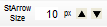 "Start Arrow Size" box /
button: Sets the ImageKit.Edit.StartArrowCapSize
property. Enter values directly in the text box or by increasing /
decreasing value button.
"Start Arrow Size" box /
button: Sets the ImageKit.Edit.StartArrowCapSize
property. Enter values directly in the text box or by increasing /
decreasing value button. "End Arrow Cap" button:
Sets the ImageKit.Edit.EndArrowCap
property.
"End Arrow Cap" button:
Sets the ImageKit.Edit.EndArrowCap
property. "End Arrow Cap Filled"
button: Sets the ImageKit.Edit.EndArrowCapFilled
property.
"End Arrow Cap Filled"
button: Sets the ImageKit.Edit.EndArrowCapFilled
property.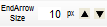 "End Arrow Size" box /
button: Sets the ImageKit.Edit.EndArrowCapSize
property. Enter values directly in the text box or by increasing /
decreasing value button.
"End Arrow Size" box /
button: Sets the ImageKit.Edit.EndArrowCapSize
property. Enter values directly in the text box or by increasing /
decreasing value button.
ToolBarSetupObjects
This toolbar control has buttons etc. that can set annotation functions other than line related annotation functions of ImageKit control. You can set properties related to the drawing of the target ImageKit control's rectangle, rounded rectangle, ellipse, pasted image, text, and stamp object.

The ToolBarSetupObjects control contains the following
elements:
- Rectangle, rounded rectangle, ellipse, pasted image related
 "Keep aspect ratio"
button: Sets the ImageKit.Edit.AspectRatio
property. Valid only for rectangles, rounded rectangles, ellipses,
and paste image objects.
"Keep aspect ratio"
button: Sets the ImageKit.Edit.AspectRatio
property. Valid only for rectangles, rounded rectangles, ellipses,
and paste image objects.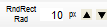 "Rounded Rectangle Rounded
Radius" box/button: Sets the ImageKit.Edit.RoundRectangleRadius property. Enter values
directly in the text box or by increasing / decreasing value
button.
"Rounded Rectangle Rounded
Radius" box/button: Sets the ImageKit.Edit.RoundRectangleRadius property. Enter values
directly in the text box or by increasing / decreasing value
button.
- Text / Stamp related
 "Font" button: Displays
the font dialog and sets the following properties for the ImageKit
control: ImageKit.Edit.FontBold property, ImageKit.Edit.FontItalic property, ImageKit.Edit.FontName property, ImageKit.Edit.FontSize property, ImageKit.Edit.FontStrikeout property, ImageKit.Edit.FontUnderline property.
"Font" button: Displays
the font dialog and sets the following properties for the ImageKit
control: ImageKit.Edit.FontBold property, ImageKit.Edit.FontItalic property, ImageKit.Edit.FontName property, ImageKit.Edit.FontSize property, ImageKit.Edit.FontStrikeout property, ImageKit.Edit.FontUnderline property. "Word Wrap" button: Sets
the ImageKit.Edit.WordWrap
property.
"Word Wrap" button: Sets
the ImageKit.Edit.WordWrap
property. "Vertical Text" button:
Sets the ImageKit.Edit.VerticalText
property.
"Vertical Text" button:
Sets the ImageKit.Edit.VerticalText
property. "Right To Left" button:
Sets the ImageKit.Edit.RightToLeft
property.
"Right To Left" button:
Sets the ImageKit.Edit.RightToLeft
property. "Border" button: Sets the
ImageKit.Edit.Border
property.
"Border" button: Sets the
ImageKit.Edit.Border
property. "Border Color" button:
Sets the ImageKit.Edit.BorderColor
property.
"Border Color" button:
Sets the ImageKit.Edit.BorderColor
property.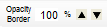 "Border Color Opacity"
box/button: Sets the ImageKit.Edit.BorderColorOpacity property. Enter values
directly in the text box or by increasing / decreasing value
button.
"Border Color Opacity"
box/button: Sets the ImageKit.Edit.BorderColorOpacity property. Enter values
directly in the text box or by increasing / decreasing value
button.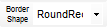 "Border shape" combo box:
Sets the ImageKit.Edit.BorderShape
property. Only valid for stamp objects.
"Border shape" combo box:
Sets the ImageKit.Edit.BorderShape
property. Only valid for stamp objects. "Character position" combo
box: Sets the ImageKit.Edit.TextAlign
property. Only valid for stamp objects.
"Character position" combo
box: Sets the ImageKit.Edit.TextAlign
property. Only valid for stamp objects.