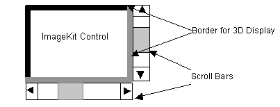
1. The ImageKit Control display basics:
An example of the ImageKit Control is shown below. In this example, the BorderVisible, Appearance, Color, and ScrollBar properties have been set.
BorderVisible:
Draws the border on the ImageKit Control
Appearance:
Sets the ImageKit Control border to lowered, raised, or flat.
Color:
Sets the background color of the ImageKit Control.
ScrollBar:
Sets whether or not scroll bars are displayed.
2. Coordinates in the ImageKit Control
The area of the ImageKit Control can be thought of as a coordinate plane that extends from the top left corner of the ImageKit Control, the origin, to the bottom right corner of the ImageKit Control.
When an image is displayed in the ImageKit Control, the location of the top left corner of the image, called OriginX and OriginY, is described in terms of its distance from the top left corner of the ImageKit Control. (i.e. OriginX = 100, OriginY = 100 means that the top left corner of the image is 100 pixels to the left and 100 pixel below the top left corner of the ImageKit Control.)
There are three properties of the ImageKit Control that affect the coordinates. These properties are the BorderVisible, Appearance, and Grad. BorderVisible, as its name implies, determines if the ImageKit Control has a border or not. When BorderVisible is true, the ImageKit Control has a border with a width of 1 pixel. Appearance can have three values, flat, raised or lowered. Raised and lowered appearance each have a width of 1 pixel. Flat appearance has no width. Finally, Grad determines if a gradient is displayed on the top and left sides of the ImageKit Control and its width is 20 pixels.
An illustration of the way that these properties interact to affect the coordinates in the ImageKit Control is shown in the following diagrams. For simplicity sake we have not included an explanation of Grad which will shift both the x, y coordinates depending on that property//s settings.
As shown in Diagram A:
a represents the outside of the top left corner of the
ImageKit Control.
b represents the inside of the top left corner of the
ImageKit Control.
c represents the inside of the bottom right corner of the
ImageKit Control.
d represents the outside of the bottom right corner of the
ImageKit Control.
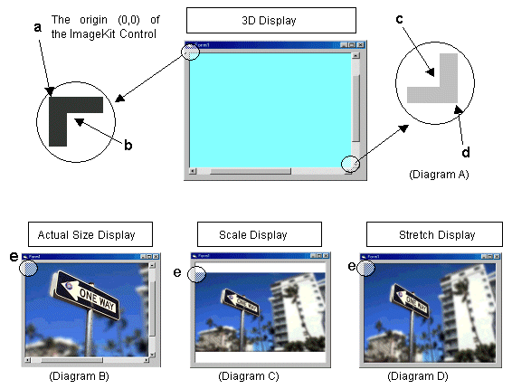
e: represents the location of the top left corner of that portion of the image being displayed in the ImageKit Control. These coordinates are known as OriginX, OriginY and are described in terms of their distance from point a.
(1) When BorderVisible=FALSE, Appearance settings are
invalid.
a: x = 0, y = 0
b: is the same as a
d: is the size of the ImageKit Control
c: is the same as d
(2) When BorderVisible=TRUE, Appearance=Flat
a: x = 0, y = 0
b: x = 1, y = 1
d: is the size of the ImageKit Control
c: x = (width of d) - 1, y = (height of d) - 1
(3) When BorderVisible=TRUE Appearance=Raised or Lowered
a: x = 0, y = 0
b: x = 2, y = 2
d: is the size of the ImageKit Control
c: x = (width of d) - 2, y = (height of d) - 2
3. ImageKit Control events
EndDispImage
- generated after an image is displayed in the ImageKit Control or
the ImageKit Control repaints.
EndDispImage(OriginX, OriginY, Left, Top, Right, Bottom,
ScaleWidth, ScaleHeight)
OriginX, OriginY: The position in the ImageKit Control where the top left corner of the image is placed. If the image is larger than the ImageKit Control in the horizontal direction, OriginX will equal 0. Likewise if the image is larger than the ImageKit Control in the vertical direction, OriginY will equal 0.
Left,Top: The distance that the top left corner of the displayed
portion of the image is from the top left corner of the actual
image.
Right,Bottom: The distance that the bottom right corner of the
displayed portion of the image is from the top left corner of the
actual image.
ScaleWidth, ScaleHeight: The scale of the displayed portion of the
image.
[Example] (See Diagram B above) Actual size display (This image is larger than the ImageKit Control)
When BorderVisible = FALSE, OriginX = 0 and OriginY = 0
When Appearance = RAISED or LOWERED, OriginX = 2 and OriginY =
2
Left = The horizontal distance between the left side of the
displayed portion of the image and the left side of the actual
image.
Top = The vertical distance between the top of the displayed
portion of the image and the top of the actual image.
Right = The horizontal distance between the right side of the
displayed portion of the image and the left side of the actual
image.
Bottom = The vertical distance between the bottom of the
displayed portion of the image and the top of the actual image
ScaleWidth, ScaleHeight = the value set in the DispScale
(Diagram C) Scale Display
When BorderVisible = FALSE, OriginX = 0 and OriginY = 30
When Appearance = RAISED or LOWERED, OriginX = 2 and OriginY = 32
(30 + 2)
Left = 0, Top = 0
Right = image width, Bottom = image height
ScaleWidth = 0.55, ScaleHeight = 0.55
(Diagram D) Stretch Display
When BorderVisible = FALSE, OriginX = 0 and OriginY = 0
When Appearance = RAISED or LOWERED, OriginX = 2 and OriginY =
2
Left = 0, Top = 0
Right = image width, Bottom = image height
ScaleWidth = 0.55, ScaleHeight =0.69
MouseDownImage - generated whenever a mouse button is
pressed
MouseDownImage(Button, OriginX, OriginY, Left, Top, Right, Bottom,
ScaleWidth, ScaleHeight, x, y)
Button: 1 - left button 2 - right button 4 - center button
OriginX,OriginY: The position in the ImageKit Control where the top left corner of the image is placed. If the image is larger than the ImageKit Control in the horizontal direction, OriginX will equal 0. Likewise if the image is larger than the ImageKit Control in the vertical direction, OriginY will equal 0.
Left,Top: The distance that the top left corner of the displayed
portion of the image is from the top left corner of the actual
image.
Right,Bottom: The distance that the bottom right corner of the
displayed portion of the image is from the top left corner of the
actual image.
ScaleWidth, ScaleHeight: The scale of the displayed portion of the
image.
x, y: The coordinates of the point on the image where the mouse
button was pressed.
MouseUpImage - generated whenever a mouse button is
released.
MouseUpImage(Button, OriginX, OriginY, Left, Top, Right, Bottom,
ScaleWidth, ScaleHeight, x, y)
Button: 1 - left button 2 - right button 4 - center button
OriginX,OriginY: The position in the ImageKit Control where the
top left corner of the image is placed. If the image is larger than
the ImageKit Control in the horizontal direction, OriginX will
equal 0. Likewise if the image is larger than the ImageKit Control
in the vertical direction, OriginY will equal 0.
Left,Top: The distance that the top left corner of the displayed
portion of the image is from the top left corner of the actual
image.
Right,Bottom: The distance that the bottom right corner of the
displayed portion of the image is from the top left corner of the
actual image.
ScaleWidth, ScaleHeight: The scale of the displayed portion of
the image.
x, y: The coordinates of the point on the image where the mouse
button was released.
MouseMoveImage - generated whenever a mouse is moved
MouseMoveImage(OriginX, OriginY, Left, Top, Right, Bottom,
ScaleWidth, ScaleHeight,x, y)
Button: 1 - left button 2 - right button 4 - center button
OriginX,OriginY: The position in the ImageKit Control where the
top left corner of the image is placed. If the image is larger than
the ImageKit Control in the horizontal direction, OriginX will
equal 0. Likewise if the image is larger than the ImageKit Control
in the vertical direction, OriginY will equal 0.
Left,Top: The distance that the top left corner of the displayed
portion of the image is from the top left corner of the actual
image.
Right,Bottom: The distance that the bottom right corner of the
displayed portion of the image is from the top left corner of the
actual image.
ScaleWidth, ScaleHeight: The scale of the displayed portion of
the image.
x, y: The coordinates of the point on the image where the mouse
movement occurred.
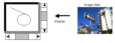
4. Displaying Images
Whenever you display an image, you must set the image in the ImageKit Control, initialize the ImageKit Control and then display the image. The syntax for this is shown below for each development container.
[Delphi]
{controlname}.LayerNo := -1;
{controlname}.File.FileName := 'c:/Image/001.jpg';
{controlname}.DisplayMode := vikScale; //or vikStretch, vikActualSize
{controlname}.File.LoadFile(ikLoad);
//loads the image and sets the ImageHandle
property
{controlname}.DisplayImage();
[C++Builder]
{controlname}->LayerNo(-1);
{controlname}->FileIO->FileName = 'c:\Image\001.jpg';
{controlname}->DisplayMode = vikScale; //or vikStretch, vikActualSize
{controlname}->FileIO->LoadFile(vikLoad);
//loads the image and sets the ImageHandle
property
{controlname}->DisplayImage();
There are two ways to set the position of an image in the ImageKit Control. The first way, using the StartX and StartY properties, places the top left corner of the image at a specified point in the ImageKit Control. The second way, using the DispCenterX and DispCenterY properties, places a specified point on the image in the center of the ImageKit Control. See below.
Displaying images from a particular position (Actual size
display only)
Example: displaying an image from a position 10 pixels to the left
and 20 pixels below the top left corner of the ImageKit
Control.
The DispCenterX and DispCenterY properties are ineffective.
DispStartX := 10;
DispStartY := 20;
DisplayMode := vikActualSize;
DisplayImage();
Displaying an image from a position where a specified point on the image is placed in the center of the ImageKit Control. (Actual size display only)
Example: The point on the image 200 pixels to the left and 100 pixels below the top left corner is placed in the center of the ImageKit Control.
Set StartX and StartY = 0
DispCenterX := 200;
DispCenterY := 100;
DisplayMode := vikActualSize;
DisplayImage();
Displaying an image at a certain magnification (Actual size
display only)
Example: Displaying an image at 1.5 times normal size
DispScaleX ;= 1.5; //sets the horizontal magnification to 1.5 times
DispScaleY ;= 1.5; //sets the vertical magnification to 1.5 times
DisplayMode = vikActualSize;
DisplayImage();
5. The device context of the ImageKit Control
(1) Canvas.Handle
This is the device context for the screen. By using the PrintDraw interface methods (or DLL functions) in conjuction with the Canvas property, you can draw lines, shapes, text, etc to the screen. Note: whatever is drawn to the Canvas will only appear on the screen and NOT be drawn to the image itself. To draw to the image, you must use the imageHdc. See below.
[Delphi Example (VCL)]
The following code will draw a line and circle on the screen (draw to the Canvas) but will not draw to the image data.
VImageKit1.LayerNo := -1;
VImageKit1.FileIO.FileName := 'c:\Image\001.jpg';
VImageKit1.DisplayMode := vikScale; //or vikStretch, vikActualSize
VImageKit1.FileIO.LoadFile(vikLoad)
//loads the image and sets the ImageHandle
property
VImageKit1.DisplayImage();
// drawing a line
VImageKit1.PrintDraw.ClearProperty;
VImageKit1.PrintDraw.PenWidth := 1;
VImageKit1.PrintDraw.PenStyle := vikPenSolid;
Ret := VImageKit1.PrintDraw.Line(VImageKit1.Canvas.Handle, 10, 10,
300, 200, vikScreen);
// drawing an ellipse
VImageKit1.PrintDraw.ClearProperty;
VImageKit1.PrintDraw.PenWidth := 2;
VImageKit1.PrintDraw.PenStyle := ikPenSolid;
VImageKit1.PrintDraw.BrushStyle := vikBrushHatchBdiagonal;
VImageKit1.PrintDraw.BrushColor := clRed;
VImageKit1.PrintDraw.Transparent = True;
Ret := VImageKit1.PrintDraw.Ellipse(VImageKit1.Canvas.Handle, 300,
200, 500, 400, vikScreen);
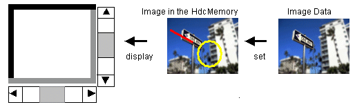
(2) ImageHdc
This is the device context for the image. By using the PrintDraw interface methods (or DLL functions) in conjuction with the ImageHdc, you can draw lines, shapes, text, etc directly to the image data. Note: whatever is drawn to the ImageHdc will not immediately appear on the screen until that image data is passed to the Canvas. This can be done using the Modify method. (see the example below)
[Delphi Example (VCL)]
The following code will draw a line and circle on the image data (draw to the ImageHdc) but the line and ellipse will not appear on the screen unless the Modify method is called.
VImageKit1.LayerNo := -1;
VImageKit1.File.FileName := 'c:\Image\001.jpg7;
VImageKit1.DisplayMode := vikScale; //or vikStretch, vikActualSize
VImageKit1.FileIO.LoadFile(vikLoad);
//loads the image and sets the ImageHandle
property
VImageKit1.DisplayImage();
VImageKit1.EditEnable := True; //enables
editing
// drawing a line
VImageKit1.PrintDraw.ClearProperty;
VImageKit1.PrintDraw.PenWidth := 1;
VImageKit1.PrintDraw.PenStyle := vikPenSolid;
Ret := VImageKit1.PrintDraw.Line(VImageKit1.ImageHdc, 10, 10, 300,
200, vikScreen);
// drawing an ellipse
VImageKit1.PrintDraw.ClearProperty;
VImageKit1.PrintDraw.PenWidth := 2;
VImageKit1.PrintDraw.PenStyle := vikPenSolid;
VImageKit1.PrintDraw.BrushStyle := vikBrushHatchBdiagonal;
VImageKit1.PrintDraw.BrushColor := clRed;
VImageKit1.PrintDraw.Transparent := True;
Ret := VImageKit1.PrintDraw.Ellipse(VImageKit1.ImageHdc, 300, 200,
500, 400, vikScreen);
To display the image data on the screen, execute the modify method. This passes the contents of the VImageKit1.ImageHdc to the VImageKit1.ImageHandle
VImageKit1.Edit.Modify
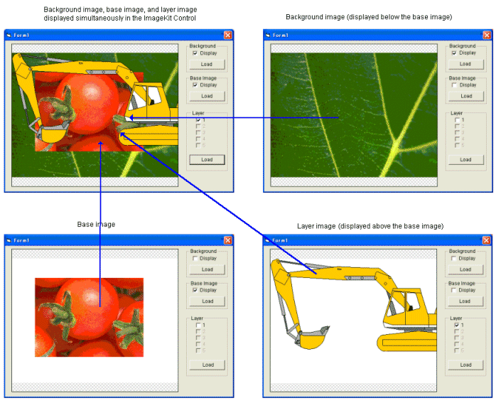
6. Image layers within the ImageKit Control.
The ImageKit10 VCL allows you to display multiple images simultaneously in the ImageKit Control. The ImageKit Control displays a background image, a base image, and up to 100 images in distinct image layers using the Layer interface. The background image is displayed, the base image is displayed on top of the background, and the images in the Layer interface are displayed above the base image. Images displayed using the Layer interface are assigned an index with the image whose index is larger being displayed on top of images whose index is smaller. If the grid property or grad property are set to true, then the grid and graduation are displayed on top of the highest image layer. Note that as the number of images displayed simultaneously increases there is a cost in processor speed and memory use, this is especially true if transparency is used.